My signature's (tell me what you think)
Hello all, in the past few weeks(months) i've been very busy with making signature's.
I really like to know what u guys think
Sigs are in a row from oldest one to newest one.


I really like to know what u guys think
Sigs are in a row from oldest one to newest one.
[img:8670fd1c10]http://i54.tinypic.com/29mmwjm.jpg[/img:8670fd1c10]

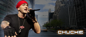
I dont like the size/text placement.
Also I don't see blending anywhere.
And needs some adjustments layers.
IMO its a bit messy.
KIU.
Also I don't see blending anywhere.
And needs some adjustments layers.
IMO its a bit messy.
KIU.


I would drop the nazi sig if i where you.
Some members might get offended.
Some members might get offended.
 Rest in Peace Hurt.
— CyBeR wroteI would drop the nazi sig if i where you.
Some members might get offended.
ye already thought so but thought it was pritty nice though
If anyone is offended by this sig plz tell me I don't like the nazi's or something but the characters are from movie's: Hellboy and Dead Snow
[img:8670fd1c10]http://i54.tinypic.com/29mmwjm.jpg[/img:8670fd1c10]
Last edited by Cartman_Mp_Shop on Tue Jun 15, 2010 4:48 pm; edited 1 times in total
— Graavie wroteI dont like the size/text placement.
Also I don't see blending anywhere.
And needs some adjustments layers.
IMO its a bit messy.
KIU.
wooow wtf are you talking about,hearing this, i see i still have a lot to learn.
Messy i can understand i always try to put a lot in it (mostly characters)
I Use GIMP 2.4 btw
[img:8670fd1c10]http://i54.tinypic.com/29mmwjm.jpg[/img:8670fd1c10]
 Watch out, im behind the boxes..
— Cartman_Mp_Shop wrote— Graavie wroteI dont like the size/text placement.
Also I don't see blending anywhere.
And needs some adjustments layers.
IMO its a bit messy.
KIU.
wooow wtf are you talking about,hearing this, i see i still have a lot to learn.
Messy i can understand i always try to put a lot in it (mostly characters)
I Use GIMP 2.4 btw
I'm not familiar with gimp, I use Photoshop.